Bootstrap Features & Services - Component Snippets
Features and services components are the next step in convincing the customer to make a purchase. It provides them with information about your product and why it is unique. This section also helps to convince potential customers that you are credible and trustworthy.
Feature Style 1
<!--====== FEATURE ONE PART START ======-->
<section class="features-area features-one">
<div class="container">
<div class="row justify-content-center">
<div class="col-lg-6">
<div class="section-title text-center">
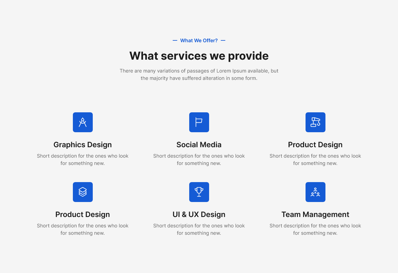
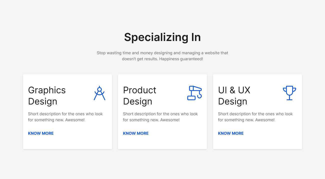
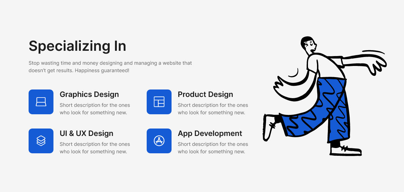
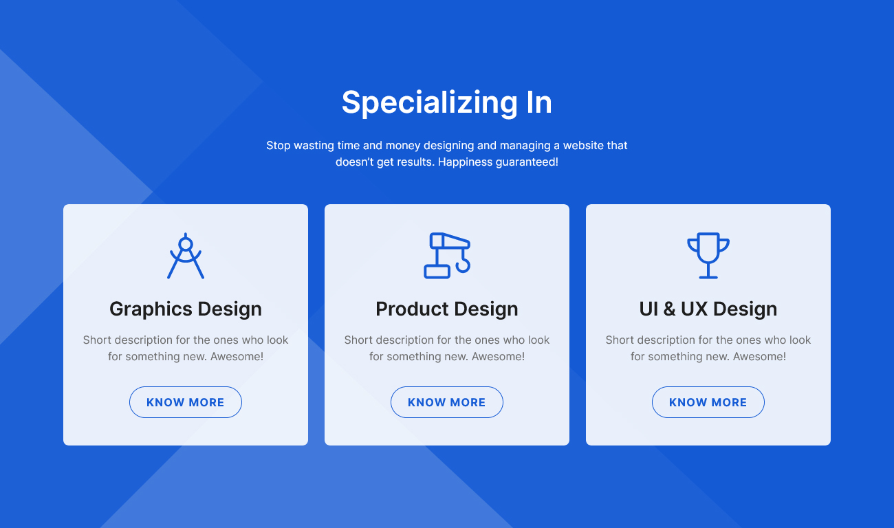
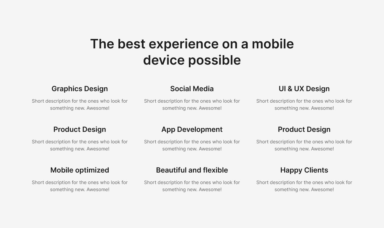
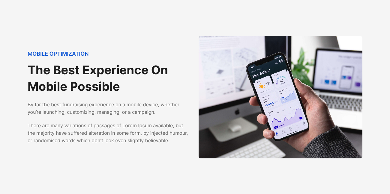
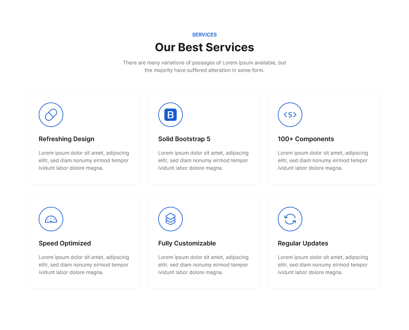
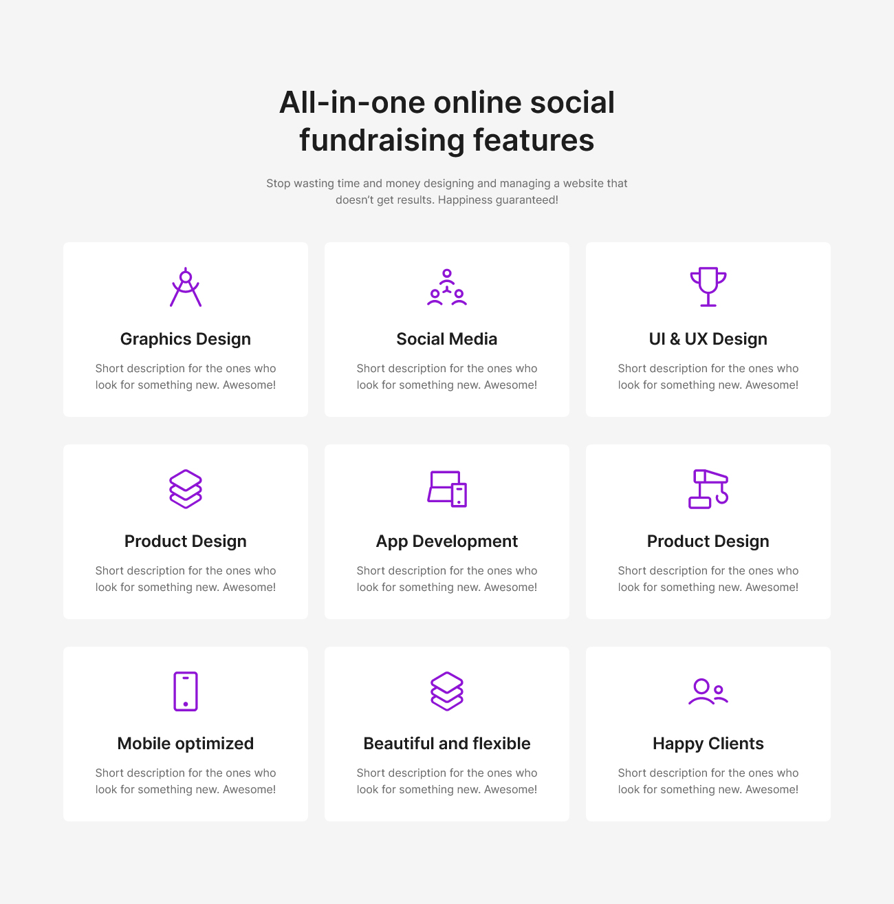
<h3 class="title">Specializing In</h3>
<p class="text">
Stop wasting time and money designing and managing a website
that doesn’t get results. Happiness guaranteed!
</p>
</div>
<!-- row -->
</div>
</div>
<!-- row -->
<div class="row justify-content-center">
<div class="col-lg-4 col-md-7 col-sm-9">
<div class="features-style-one text-center">
<div class="features-icon">
<i class="lni lni-compass"></i>
</div>
<div class="features-content">
<h4 class="features-title">Graphics Design</h4>
<p class="text">
Short description for the ones who look for something new.
Awesome!
</p>
<div class="features-btn rounded-buttons">
<a
class="btn primary-btn-outline rounded-full"
href="javascript:void(0)"
>
KNOW MORE
</a>
</div>
</div>
</div>
<!-- single features -->
</div>
<div class="col-lg-4 col-md-7 col-sm-9">
<div class="features-style-one text-center">
<div class="features-icon">
<i class="lni lni-construction"></i>
</div>
<div class="features-content">
<h4 class="features-title">Product Design</h4>
<p class="text">
Short description for the ones who look for something new.
Awesome!
</p>
<div class="features-btn rounded-buttons">
<a
class="btn primary-btn-outline rounded-full"
href="javascript:void(0)"
>
KNOW MORE
</a>
</div>
</div>
</div>
<!-- single features -->
</div>
<div class="col-lg-4 col-md-7 col-sm-9">
<div class="features-style-one text-center">
<div class="features-icon">
<i class="lni lni-cup"></i>
</div>
<div class="features-content">
<h4 class="features-title">UI & UX Design</h4>
<p class="text">
Short description for the ones who look for something new.
Awesome!
</p>
<div class="features-btn rounded-buttons">
<a
class="btn primary-btn-outline rounded-full"
href="javascript:void(0)"
>
KNOW MORE
</a>
</div>
</div>
</div>
<!-- single features -->
</div>
</div>
<!-- row -->
</div>
<!-- container -->
</section>
<!--====== FEATURE ONE PART ENDS ======-->/* ===== Buttons Css ===== */
.features-style-one .primary-btn-outline {
border-color: var(--primary);
color: var(--primary);
}
.features-style-one .active.primary-btn-outline, .features-style-one .primary-btn-outline:hover, .features-style-one .primary-btn-outline:focus {
background: var(--primary-dark);
color: var(--white);
}
.features-style-one .deactive.primary-btn-outline {
color: var(--dark-3);
border-color: var(--gray-4);
pointer-events: none;
}
/*===========================
Features One CSS
===========================*/
.features-one {
background-color: var(--light-2);
padding-top: 120px;
padding-bottom: 120px;
}
.features-one .section-title {
padding-bottom: 10px;
}
.features-one .title {
font-size: 44px;
font-weight: 600;
color: var(--black);
line-height: 55px;
}
@media (max-width: 767px) {
.features-one .title {
font-size: 30px;
line-height: 35px;
}
}
.features-one .text {
font-size: 16px;
line-height: 24px;
color: var(--dark-3);
margin-top: 24px;
}
.features-style-one {
background-color: var(--white);
padding: 40px 20px;
margin-top: 40px;
box-shadow: var(--shadow-2);
border-radius: 4px;
transition: all 0.3s;
}
.features-style-one:hover {
box-shadow: var(--shadow-4);
}
.features-style-one .features-icon {
position: relative;
display: inline-block;
z-index: 1;
height: 100px;
width: 100px;
line-height: 100px;
text-align: center;
font-size: 40px;
color: var(--primary);
border: 2px solid rgba(187, 187, 187, 0.192);
border-radius: 50%;
-webkit-transition: all 0.3s ease-out 0s;
-moz-transition: all 0.3s ease-out 0s;
-ms-transition: all 0.3s ease-out 0s;
-o-transition: all 0.3s ease-out 0s;
transition: all 0.3s ease-out 0s;
}
@media (max-width: 767px) {
.features-style-one .features-icon {
height: 70px;
width: 70px;
line-height: 70px;
font-size: 35px;
}
}
.features-style-one:hover .features-icon {
border-color: transparent;
color: var(--white);
background-color: var(--primary);
}
.features-style-one .features-content {
margin-top: 24px;
}
.features-style-one .features-title {
font-size: 26px;
line-height: 35px;
font-weight: 600;
color: var(--black);
-webkit-transition: all 0.3s ease-out 0s;
-moz-transition: all 0.3s ease-out 0s;
-ms-transition: all 0.3s ease-out 0s;
-o-transition: all 0.3s ease-out 0s;
transition: all 0.3s ease-out 0s;
}
@media only screen and (min-width: 992px) and (max-width: 1199px), (max-width: 767px) {
.features-style-one .features-title {
font-size: 22px;
}
}
.features-style-one .text {
color: var(--dark-3);
margin-top: 16px;
}
.features-style-one .features-btn {
margin-top: 32px;
}Feature Style 11
Feature Style 12
Feature Style 7
Feature Style 2
Feature Style 9
Feature Style 14
Feature Style 8
Feature Style 20
Feature Style 5
Feature Style 18
Feature Style 19
Feature Style 6
Feature Style 4
Feature Style 13
Feature Style 15
Feature Style 16
Feature Style 21
Feature Style 3
Feature Style 10
Feature Style 17