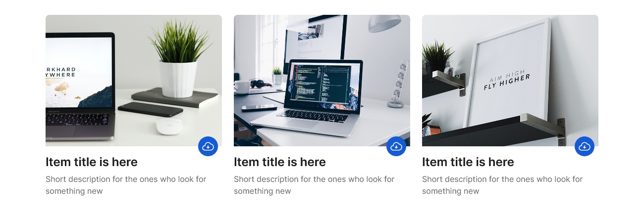
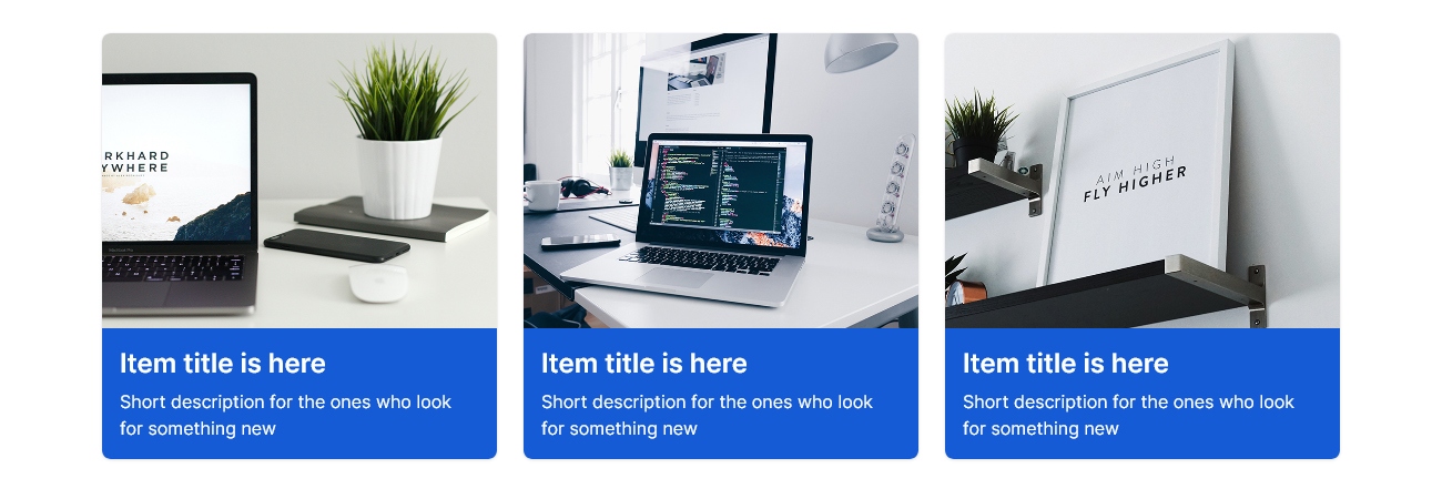
Bootstrap Cards - Component Snippets
Bootstrap Cards is a powerful and universal content container that will undoubtedly change the way you think about web design. It's not just a card. It's not just a modal. It's not just a dropdown or a menu. Bootstrap Cards is all of these and more, and it does it with style!
Card Style 1
<!--====== CARD PART START ======-->
<section class="card-area pb-5">
   <div class="container">
      <div class="row justify-content-center">
         <div class="col-lg-4 col-md-7 col-sm-9">
            <div class="single-card card-style-one">
               <div class="card-image">
                  <img src="https://cdn.ayroui.com/1.0/images/card/card-1.jpg" alt="Image" />
               </div>
               <div class="card-content">
                  <h4 class="card-title">
                     <a href="javascript:void(0)">Item title is here</a>
                  </h4>
                  <p class="text">
                     Short description for the ones who look for something new
                  </p>
               </div>
            </div>
            <!-- single-card -->
         </div>
         <!-- col -->
         <div class="col-lg-4 col-md-7 col-sm-9">
            <div class="single-card card-style-one">
               <div class="card-image">
                  <img src="https://cdn.ayroui.com/1.0/images/card/card-2.jpg" alt="Image" />
               </div>
               <div class="card-content">
                  <h4 class="card-title">
                     <a href="javascript:void(0)">Item title is here</a>
                  </h4>
                  <p class="text">
                     Short description for the ones who look for something new
                  </p>
               </div>
            </div>
            <!-- single-card -->
         </div>
         <!-- col -->
         <div class="col-lg-4 col-md-7 col-sm-9">
            <div class="single-card card-style-one">
               <div class="card-image">
                  <img src="https://cdn.ayroui.com/1.0/images/card/card-3.jpg" alt="Image" />
               </div>
               <div class="card-content">
                  <h4 class="card-title">
                     <a href="javascript:void(0)">Item title is here</a>
                  </h4>
                  <p class="text">
                     Short description for the ones who look for something new
                  </p>
               </div>
            </div>
            <!-- single-card -->
         </div>
         <!-- col -->
      </div>
      <!-- row -->
   </div>
   <!-- container -->
</section>
<!--====== CARD PART ENDS ======-->/*===========================
card-01 css
===========================*/
.single-card {
box-shadow: var(--shadow-1);
border-radius: 8px;
overflow: hidden;
margin-top: 30px;
-webkit-transition: all 0.3s ease-out 0s;
-moz-transition: all 0.3s ease-out 0s;
-ms-transition: all 0.3s ease-out 0s;
-o-transition: all 0.3s ease-out 0s;
transition: all 0.3s ease-out 0s;
}
.single-card:hover {
box-shadow: var(--shadow-4);
}
.single-card .card-image img {
width: 100%;
height: 100%;
}
.single-card .card-content {
padding: 16px;
}
.single-card .card-content .card-title {
margin-bottom: 0;
}
.single-card .card-content .card-title a {
color: var(--black);
-webkit-transition: all 0.3s ease-out 0s;
-moz-transition: all 0.3s ease-out 0s;
-ms-transition: all 0.3s ease-out 0s;
-o-transition: all 0.3s ease-out 0s;
transition: all 0.3s ease-out 0s;
}
.single-card .card-content .card-title a:hover {
color: var(--primary);
}
.single-card .card-content .text {
color: var(--dark-3);
margin-top: 8px;
}Card Style 6

Card Style 10

Card Style 2

Card Style 4

Card Style 11

Card Style 12

Card Style 13

Card Style 5

Card Style 8

Card Style 3

Card Style 7

Card Style 14

Card Style 9
